25 Brilliantly Clever Print Ads

#1 “Hulk Have Boo-Boo”
In this imaginative ad,
Band-Aid highlights the flexible fabric of their bandages by showing the
Incredible Hulk’s hand with a bandage. Hulk’s alter ego is Bruce Banner
who transforms into the Hulk when he gets angry. We’re left to assume that
Bruce was already wearing the bandage.

#2 “Shhhhhhhh”
This ad was created by
Cheil Worldwide Hong Kong with the campaign title “Block Out The Chaos”. The
beautiful art direction uses 3D illustrations and negative space to portray how
well their noise-cancelling headphones work. With quite a few different
variations out there, the Donald Trump/Kim Jong Un one spoke to us the most.

#3 The Perils of Parallel
Parking
Developed by DBB Tribal, the Volkswagon ad campaign put a focus on the
company’s new park assist feature by highlighting the risks that can be
associated when you tightly park between two cars. This ad uses animal
symbolism to send a message of being able to safely park using the vehicles’
newest feature.

#4 “On Your Left”
Designed by Steve Quint, the iPod shuffle headphones smartly map out the
user’s running route in this ad. This kind of imagery can take a typical use of
a product and present it in a creative way that consumers will be able to
relate to.

#5 “FORE!!”
Over the years MasterCard has put out many different types of print ads
showing how their card can make experiences priceless. As a sponsor of the 2012
Women’s Golf Classic, MasterCard hired Maclaren McCann who combined a
traditional image of a golf ball on a tee with a high heel shoe. The result is
an amazing ad that speaks directly to their demographic without any confusion.

#6 – Colgate Floss
With a minimalist design, Colgate
commissioned Y&R to create this ad for their dental floss. The focus on the
seeds in the fruit paints a real picture for anyone who has ever gotten a seed
caught between their teeth.

#7 – Fleas off, please!
Designed by Pervanal Saatchi & Saatchi, this ad for Frontline Flea
& Tick Spray was installed as a giant floor sticker in a shopping mall in
Jakarta, Indonesia. From higher levels, the people walking in the picture look
like fleas on and off the dog. This is a great way to use perspective and
imagery in an advertisement.

#8 – “We are made of Rock”
Designed by Italy’s own DLV BBDO, the image and the handwritten tagline fit a music magazine like Rolling Stone perfectly. The image is very readable
and portrays the magazine’s attitude, ethos, and most importantly, the product
ideally.

#9 – Finger Lickin Good!
If you own a phone that looks like this, you may want to upgrade. Now.
Designed by Zane Zhou, along with LamanoStudio from Chile, the company’s famous
tagline of “Finger Lickin Good” is taken to new heights with their inventive
take of putting mouths waiting to taste the KFC chicken on surfaces that our fingers
normally touch. Other ads in this series included a keyboard and a video games
controller. As inventive as it is, it is also nightmare-inducing.
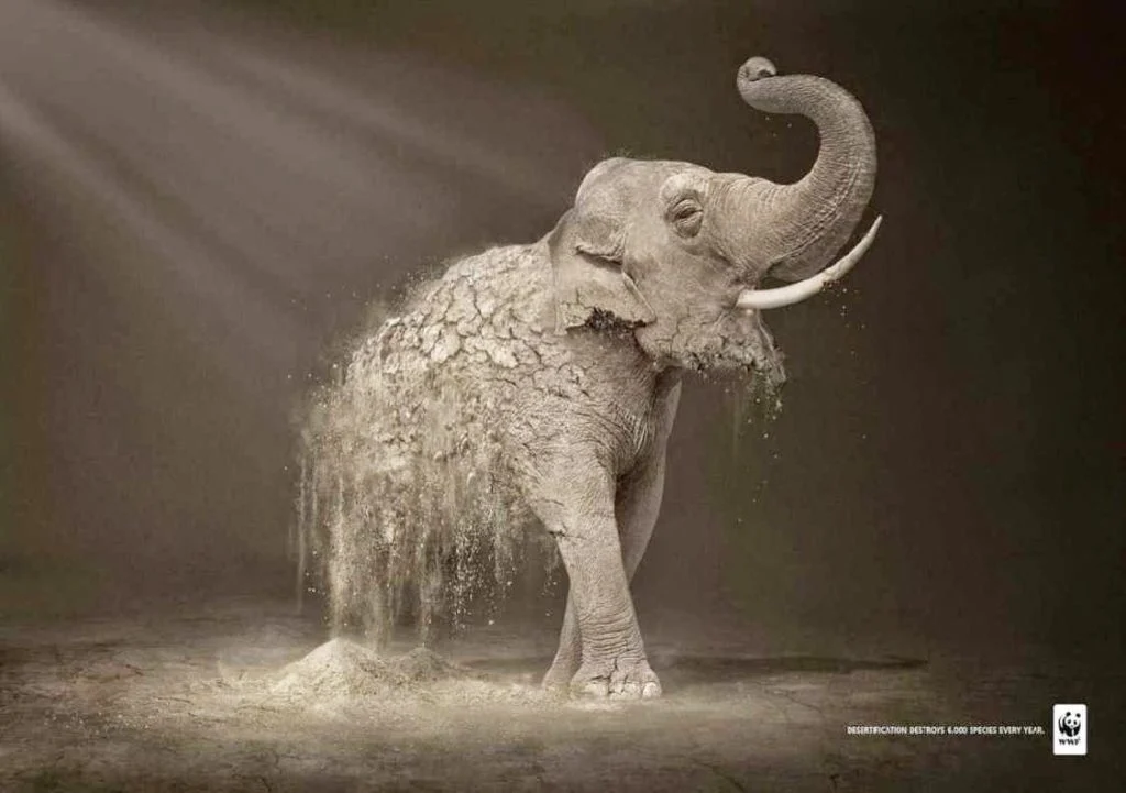
#10 – What if they were gone?
The World Wildlife Fund uses striking imagery to get their message of
helping to save endangered species across. With their “Desertification”
campaign, they use striking images of some of the most amazing animals turning
to dust. This kind of ad can create an emotional response in people and start
conversations about what can be done to help.

#11 – You eat what they eat
The amount of pollution in the oceans is at an alarming level that many
people would rather ignore than think about it. Designed by Ogilvy, their stark
imagery of a fish-shaped like some of the garbage thrown into the ocean.
Developed for Sea Shepherd Conservation Society, which is an international
non-profit, marine wildlife conservation organization, the ad hopes to drive
awareness of the issues with the ocean and hopefully donate to Sea Shepherd.

#12 – You either see one or the other
Texting and driving are still a major problem on the world’s roadways.
Fiat, n collaboration with designer Leo Burnett developed a campaign to try and
curb texting and driving. Texting while driving diverts your focus and this ad
uses an ambiguous image to portray and bring attention to a real problem.

#13 – Fireworks!
Sometimes the best minimalistic ads say more than others ever could.
Barilla used an inventive way to ring in the new year with a minimalistic ad
using their spaghetti product as fireworks. It is a great way to use an
otherwise basic product in a new and interesting way.

#14 – Go on a run
Ad Agency VITRO worked alongside Asics during their sponsorship of the Los
Angeles Marathon in 2015. In the end, the collaboration produced a beautiful
image of important landmarks across L.A. including Dodger Stadium, the
Hollywood sign, and the Capitol Records building, the city was well represented
in the advertisement for the marathon.

#15 – Even a superhero drives one
Developed by Creative Director Marco Gioe, the ad for this BMW sees the DC
Comics superhero The Flash behind the wheel to show consumers that this car is
fast because obviously, The Flash knows a thing or two about speed.

#16 – Bottoms Up!
In many restaurants these days you’ll see more people on their phones than
talking to the people they are with. Guinness has had enough of this disturbing
trend by releasing an ad that takes those cell phones and stacks them to form
an image of a pint of Guinness beer, reminding people that it is better to be
social than isolated behind a phone screen.

#17 – Choose your adventure
Created by Leo Burnett France, this ad campaign plays up the idea that with
a Jeep, you can go just about anywhere and see what you want to see. Using
images of animals that when turned upside down, show another animal from the
other side of the world. Other variations included an elephant and a swam as
well as a doe and a sea lion.

#18 – Nature Doesn’t Need Tattoos
The World Wildlife Fund is not shy when it comes to the ads that they put
out to get their message across, With this ad created by Chris Garbutt of
Ogilvy & Mather Paris puts graffiti on the beautiful white fur of polar
bears to get their message across.

#19 -Head to the Gym
Sometimes, playing on people’s insecurities can send a powerful message. This
ad from Gold’s Gym creatively uses a person’s body to show the type of changes
that were made by going to their gym. Fat? Fit? For someone who might not be
happy with how they look physically, this can be a really powerful ad.

#20 – Like sucking on a tailpipe
Developed for use by roadside food carts, JWT Hong Kong created these cup
lids to bring awareness to the air pollution issue. This ad helped to get
customers thinking while being surrounded by the problem.

#21 – Pee with a purpose
It’s not normally a good sign if someone wants to pee on your
advertisement, but in the case of Ikea ad, they encourage women to do so. The ad
doubles as a pregnancy test that if positive, will offer a half-price coupon
for a new baby crib. This creative ad was designed by the Akestam Holst agency
in conjunction with material company Mercene Labs.

#22 – Here Kitty Kitty
With their ‘Big Cat, Small Cat’ campaign, Whiskas wanted to focus on a
cat’s instincts. Developed by Abbot Mead Vickers BBDO with photography by
George Logan, the combination of a housecat hunting down prey is a striking
image and comes in different variations including hunting elephants and zebras.
There is even a variation where a male lion bonds with a housecat.

#23 – One Story. Two Points.
Brazilian agency FCB developed this creative ad for Sharpie with the
tagline: ‘One story. Two Points’ in order to promote the release of a new
Sharpie pen with two points. The comic art style presents two separate points
of view of a major news story. For years, Sharpie has produced amazing print
ads and this one is no different.

#24 – The Only Limit is Your Imagination
For their new brand campaign, Play-Doh turned to DDB advertising agency to help launch it. Creating Play-Doh designs by hand took an incredible amount of patience and time, but it was well worth the effort and sends a beautiful message:
“The world of Play-Doh is the world as it should be. A dream world, born of
the boundless imagination of children. A world in which everyone has a grip.
That each can shape infinitely. “

#25 – There’s always more beneath the surface
Created by ad agency Saatchi & Saatchi, this wonderful illustration of
St. Basil’s church in Moscow was intended to promote the available information
at the Schusev State Museum of Architecture. Featuring the tagline ‘Discover the
full story, the imagery features photographs of famous Russian landmarks and
their continuation below ground or water.
March 24, 2022, by Jacob Cass
Great👍👍
ReplyDeleteI love this page, So usfull for us, beautiful and creative page, good job you've done, keep posting. Thanks
ReplyDeletevery impressive....
ReplyDeletevery impressive....
ReplyDeleteGreat work and analysis! Love it!
ReplyDelete